Almost 10 years ago we wrote a blog post about temperature and buck movements during the rut. If you enjoy spoilers, you can read it.
But it also has been a decade and we have a lot more locations on buck movements (97,979 to be exact). So maybe we can observe something new from our data?
Let’s start by laying some facts on the table.
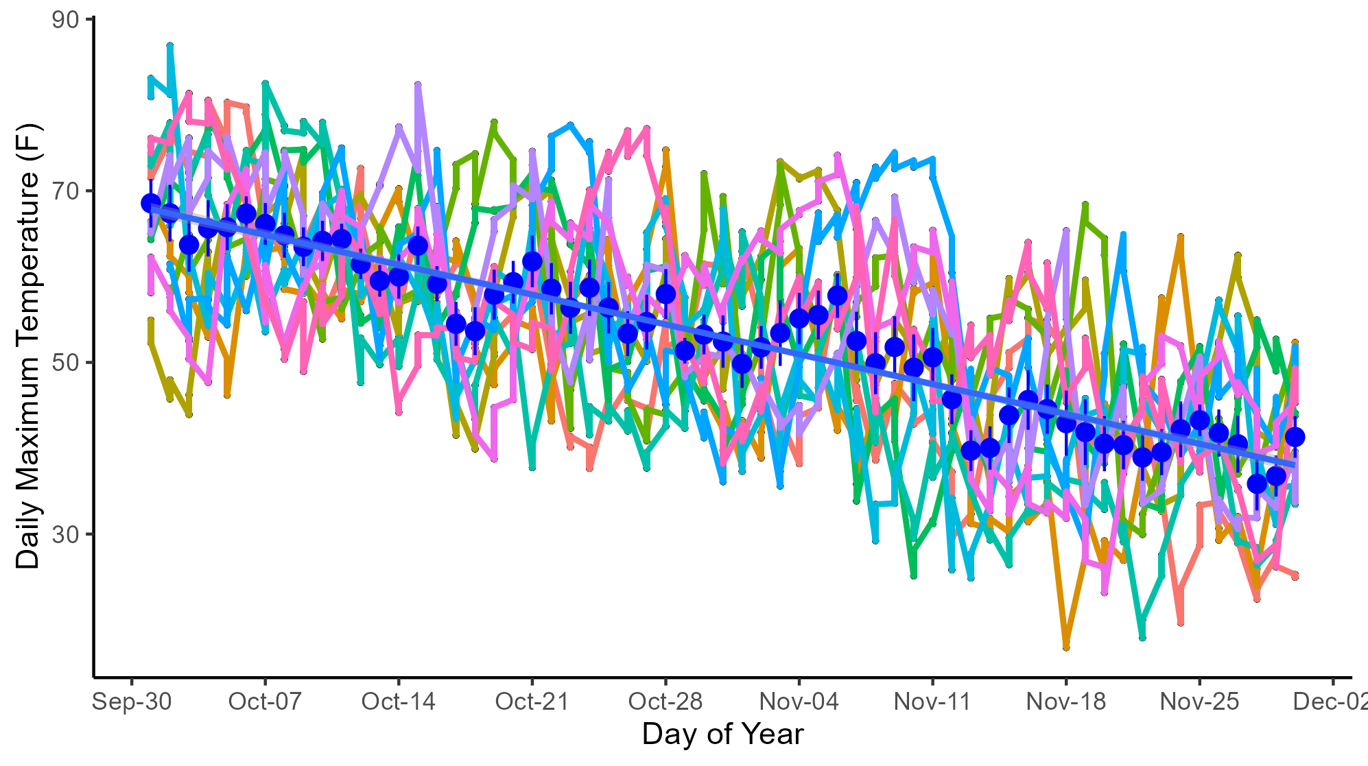
This is what temperature has done during the rut from 2013–2023. The blue line is the trendline, blue dots are the daily average, which indicate from October 1 to December 1 the average temperature drops, on average, half a degree every day. But on any given day the maximum temperature could differ by as much as 20 degrees. The daily minimum temperature does the same thing except it averages about 20 degrees cooler.
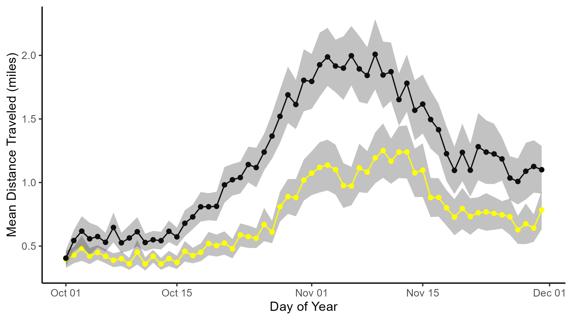
Over 2013–2023, in the graph below are the average buck movements during the day (yellow) and during the night (black). The gray area is a measure of the variability about the means. You can see that bucks travel about twice as far at night than during the day at the peak of the breeding season.
But you also need to remember that daylength is getting shorter so there are more hours in the dark. So even if bucks traveled at the same speed all 24 hours, they would cover fewer miles during daylight hours. That means NOT ALL of the difference between night and day is because bucks move more at night. If you want to learn more about buck travel speeds during the rut, read this.
Let’s plot the average distance moved during the daytime as a function of daily maximum temperature. Look at that! The warmer it is the fewer miles they travel!
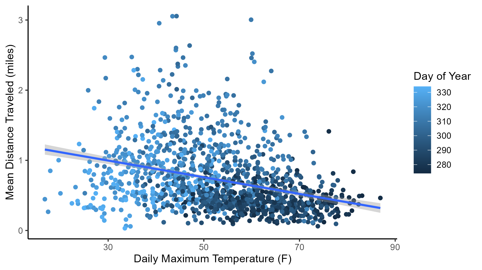
But hold on a minute. When is it warmest? In early October when the rut hasn’t really started (see all those dark blue dots in the lower right corner of the cloud of points? Those are days in early October before the rut has kicked in.)
I don’t think this graph tells us anything about how temperatures affect deer movement.
Let’s try this. If it’s warmer than normal, then the maybe daily movements are less than normal? Let’s plot the following:
- On the x axis will be the daily maximum temperature
- On the y axis will be the difference in movement compared to the mean distance traveled. For example, if it were November 13th and the 2013-2023 average distance traveled was 2 miles, and if on November 13, 2020 the average distance that bucks traveled was 1.5 miles, then the y-axis value would be -0.5. That is, in 2023 bucks traveled 0.5 miles less than the 2013-2023 average.
- The prediction, based on what I’ve read in the comments section, is that if deer only traveled 1.5 miles on November 13, 2020 then the daily maximum temperature must be warmer than usual.
- At warmer temperatures we should see below-average movements (y-axis values less than zero).
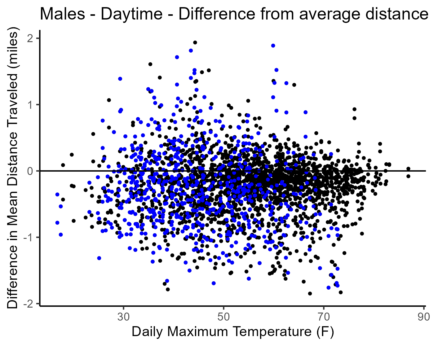
Umm… I don’t see any pattern. And statistically there is no relationship between deviations from the average distance moved and daily maximum temperature. The blue dots are movements during peak rut (1 week either side of November 13).
Let’s try it for nighttime but use daily minimum temperature.
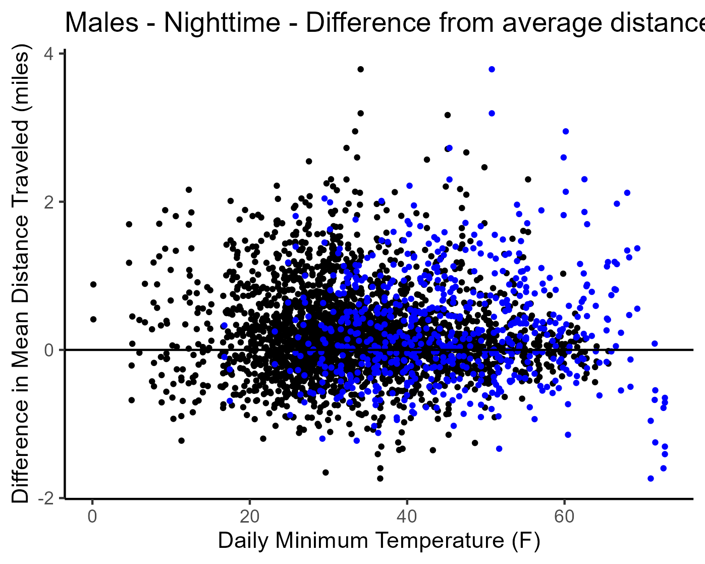
Once again, no relationship. And again the blue dots are movements during peak rut (1 week either side of November 13).
Every single year, throughout the rut, we regularly experience deviations in temperature of 10 degrees from average – either warmer than average or cooler than average. Yet the deviations in movements from one year to the next cannot be explained by changes in temperature.
I think our next question should be “Why AREN’T buck movements related to temperature?”
It’s the more important question. I’ll cover that in my next post.
-Duane Diefenbach